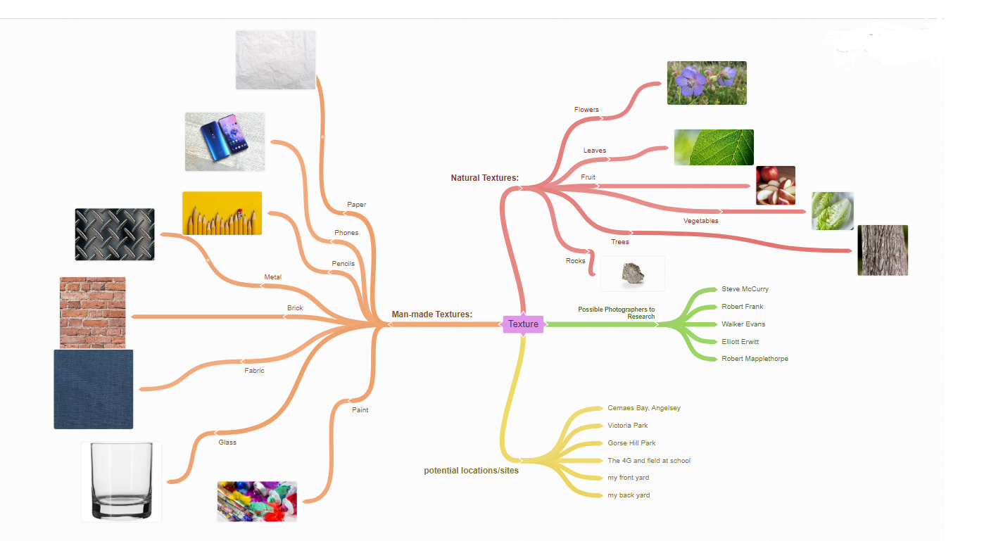
Texture is my chosen theme for this project and I am choosing this theme because due to covid it is more difficult to go out and take landscape photos and this theme is easy to capture in tabletop shoots, studio shoots and the environment close to where I live. As well as that, in the time I do get to spend outside I am able to still capture texture in what I photograph. To keep up with this theme, I am going to research photographers who capture texture well (for example: Lucy Shires) and research different man made and natural textures that are easy to capture and look good in photographs.
The specific photographers I am planning to research are Edward Weston, Roe Ethridge, Lucy Shires, Imogen Cunningham, Andy Small and Annabelle Breakey. Edward Weston generally photographed shells in black and white so his photos were generally quite monochromatic which is a contrast to the type of photographs Andy Small and Annabelle Breakey took as their photographs were generally bright colours against vibrant backgrounds.
For my photoshoots I am planning to do a fruit and vegetable studio shoot, a man made texture shoot (for example: fabrics, textured paper, bubble wrap etc) and a shell shoot.
I am hoping to utilize a central focal point and the rule of even and odd to make my photographs look aesthetically pleasing, I am also hoping to manipulate the camera angle to make my photographs look better. I may end up using the tripod in the studio shoots for a cleaner and less shaky result. For some photos I think I’ll change the aperture to make the background out of focus so the attention isn’t drawn away from the focus of the photograph, I will try to keep the ISO as low as possible to prevent excessive noise in my photographs and I will change my white balance to suit where I’m taking my photos. Using Photoshop I am hoping to edit some of my photographs similarly to the way some of the photographers I will research: an example of this would be editing the hue and saturation similarly to Lucy Shires’ photographs, or making the image black and white similarly to Imogen Cunningham’s photographs. I will also aim to use Photoshop to create patterns to highlight the textures of my subjects.
In this project I am hoping to capture the feel and quality of both man made and natural objects over photographs similarly to other photographers to show the smaller details of the objects. I am also hoping to learn more about different photographers and how they capture textures in their photographs.
For my final format, I aim to hopefully print out my best edited photographs and possibly some photographs without edits if they are taken well.
Photography Analysis: C'est Pas Du Luxe-Roe Ethridge

Context:
From my research I believe that the image was printed in 2012. It was published in his book Le Luxe which contained his works from the past ten years. From my research I believe that the photographer may draw some inspiration from Matisse as he named two of his paintings Le Luxe. As well as this, his narrative “offers an uneasy balance to the fissures between analogue and digital and Ethridge's consistent undermining of his own certainties” (source: https://photobookstore.co.uk/products/le-luxe). In his book, there is a range of images, including personal images, online work and commissions, it is a retrospective of his work from that decade.
Content:
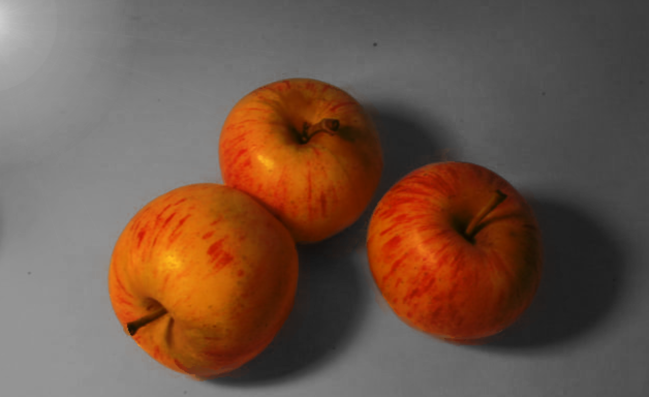
The photographer has taken a still life image of two apples with six wasps eating them. It is realistic rather than abstract and none of the components have been distorted. The title of the image is C’est Pas Du Luxe which is a French phrase that means ‘to be to have too much, so much that it is wasted’. Knowing the title of the image can then change the implications of it as you can then see that it implies that we as humans could tend to have too much and therefore a lot goes to waste. I believe that the work represents people's tendencies to take more than they need of things and therefore as a species we tend to waste a lot. The work seems to communicate that while the wasps could eat both of the apples, if they ate them both they’d most likely die so therefore some of the apples will have to go to waste and like I said above I believe it shows how that is also done a lot by people. The drastic difference between the size of the wasps and the size of the apples, strongly emphasizes the message of the title.
Composition:
He utilized the rule of even and odd in this image by using only even numbers in the image which in my opinion is used to make the apples seem unnatural and then the fact the wasps have so many apples would also seem unnatural to the viewer as it can appear unbalanced. Also, the wasps in proportion to the apples makes the apples seem even more daunting and big, making the implication of greed seem even clearer to the viewer. The apples seem even more daunting as there are pieces nearby that have been chopped up yet the apples still seem huge compared to the wasps. As well as that, the table makes it split on the horizontal, cutting the image well. In my opinion, the image has a central focal point as my eyes were immediately drawn to the apples in the centre. In this image, Ethridge also clearly used a studio light as the shadows would be a lot less bold in comparison to if he had used natural light and the same with the colours, the colours would seem a lot more diffused if natural light had been used. I believe this image has used the rule of thirds as the two apples (more the one in the background) line up with the grid for the rule of thirds. The background is out of focus, meaning the photographer most likely used a small depth of field therefore I believe the image may be around an f/stop of f/2. I also believe he may have used a shutter speed of 1/2000 as he was able to capture insects without the image becoming blurred. In the image the colours red and green have been used next to each other, they’re contrasting colours. The two colours are juxtaposed against each other which draws your eyes to the apple in the image and highlights it as the subject rather than allowing your attention to be drawn to the background. I believe Ethridge may have used a tripod to capture the image given how close it appears to be to the subjects. There is a blurred background and the middle ground of the image is likely the emphasis of the image with the apples and the wasps although there are four pieces of apple that I believe are in the image's foreground.
Connection:
This connects to our photoshoots as one of the main subjects is an apple and our photoshoot was of different kinds of fruits and vegetables. As well as this, some of the compositional elements we used were the same as in our shoot: I tried my best to use the rule of even and odd, experimenting with how many of the subjects were in the shot and seeing what’d look more natural. Following my research, I quite like the image, as well as how well you can tell more of the implications of it once you know the title but before that it's up to your own interpretation. I also like how you can link the message to modern day life because as a species humans tend to bite off more than they can chew and therefore waste a lot. I really like the way the image conveys a message, because not all photography has to have a message, some can be just pure aestheticism, however, this one does have a message and I hope to take photos with messages and meanings behind them too. A strength of this image is that once you know the title, the meaning behind it becomes clear and the only possible weakness I can see in the image is that there are a couple of bright stripes of yellow in the background which can draw your attention towards the background.
From my research I believe that the image was printed in 2012. It was published in his book Le Luxe which contained his works from the past ten years. From my research I believe that the photographer may draw some inspiration from Matisse as he named two of his paintings Le Luxe. As well as this, his narrative “offers an uneasy balance to the fissures between analogue and digital and Ethridge's consistent undermining of his own certainties” (source: https://photobookstore.co.uk/products/le-luxe). In his book, there is a range of images, including personal images, online work and commissions, it is a retrospective of his work from that decade.
Content:
The photographer has taken a still life image of two apples with six wasps eating them. It is realistic rather than abstract and none of the components have been distorted. The title of the image is C’est Pas Du Luxe which is a French phrase that means ‘to be to have too much, so much that it is wasted’. Knowing the title of the image can then change the implications of it as you can then see that it implies that we as humans could tend to have too much and therefore a lot goes to waste. I believe that the work represents people's tendencies to take more than they need of things and therefore as a species we tend to waste a lot. The work seems to communicate that while the wasps could eat both of the apples, if they ate them both they’d most likely die so therefore some of the apples will have to go to waste and like I said above I believe it shows how that is also done a lot by people. The drastic difference between the size of the wasps and the size of the apples, strongly emphasizes the message of the title.
Composition:
He utilized the rule of even and odd in this image by using only even numbers in the image which in my opinion is used to make the apples seem unnatural and then the fact the wasps have so many apples would also seem unnatural to the viewer as it can appear unbalanced. Also, the wasps in proportion to the apples makes the apples seem even more daunting and big, making the implication of greed seem even clearer to the viewer. The apples seem even more daunting as there are pieces nearby that have been chopped up yet the apples still seem huge compared to the wasps. As well as that, the table makes it split on the horizontal, cutting the image well. In my opinion, the image has a central focal point as my eyes were immediately drawn to the apples in the centre. In this image, Ethridge also clearly used a studio light as the shadows would be a lot less bold in comparison to if he had used natural light and the same with the colours, the colours would seem a lot more diffused if natural light had been used. I believe this image has used the rule of thirds as the two apples (more the one in the background) line up with the grid for the rule of thirds. The background is out of focus, meaning the photographer most likely used a small depth of field therefore I believe the image may be around an f/stop of f/2. I also believe he may have used a shutter speed of 1/2000 as he was able to capture insects without the image becoming blurred. In the image the colours red and green have been used next to each other, they’re contrasting colours. The two colours are juxtaposed against each other which draws your eyes to the apple in the image and highlights it as the subject rather than allowing your attention to be drawn to the background. I believe Ethridge may have used a tripod to capture the image given how close it appears to be to the subjects. There is a blurred background and the middle ground of the image is likely the emphasis of the image with the apples and the wasps although there are four pieces of apple that I believe are in the image's foreground.
Connection:
This connects to our photoshoots as one of the main subjects is an apple and our photoshoot was of different kinds of fruits and vegetables. As well as this, some of the compositional elements we used were the same as in our shoot: I tried my best to use the rule of even and odd, experimenting with how many of the subjects were in the shot and seeing what’d look more natural. Following my research, I quite like the image, as well as how well you can tell more of the implications of it once you know the title but before that it's up to your own interpretation. I also like how you can link the message to modern day life because as a species humans tend to bite off more than they can chew and therefore waste a lot. I really like the way the image conveys a message, because not all photography has to have a message, some can be just pure aestheticism, however, this one does have a message and I hope to take photos with messages and meanings behind them too. A strength of this image is that once you know the title, the meaning behind it becomes clear and the only possible weakness I can see in the image is that there are a couple of bright stripes of yellow in the background which can draw your attention towards the background.
Photography Analysis: Nautilus-Edward Weston

Context:
The photograph I have chosen to analyze is called Nautilus and was taken by Edward Weston in 1927. This photograph was taken in Glendale, California. Weston took many photographs, ranging from still lifes to portraits, all seemingly with a black and white filter. As far as I’m aware, the work doesn’t link to any issues at the time. For the inspiration behind the photograph, Weston is said to have visited the studio of artist Henrietta Shore and noticed many of her paintings of seashells which allegedly had a profound effect on Weston (source: https://en.wikipedia.org/wiki/Nautilus_(photograph)).
Content:
In this photograph there is a nautilus shell photographed against a plain black backdrop. From the patch of light on the front of the shell you can infer that Weston has most likely used studio lighting or at least a lamp to shine more light onto the photograph. This photograph is a still life and the title Nautilus informs the viewer on what type of shell is being photographed here. It is realistic and no parts of the photograph appear to be distorted or manipulated. A theme of Weston’s work is that most, if not all, of his photographs are taken in black and white which can create quite a vintage and nostalgic effect when people view them in the present day, making people think of happier times, especially with the fact that he is photographing shells which can give people connotations of holidays. I believe that there isn’t a message behind this photograph, Weston just found the shell aesthetically pleasing and therefore wanted to photograph it.
Composition:
I believe that here Weston has tried to make the photograph symmetrical as you could draw a line down the middle and both sides would look almost identical. As well as this, I believe in this photograph Weston has used simplification and stripped the photograph down to its most basic elements, the black background and the nautilus shell, nothing else. Weston has used a bird’s eye view to capture this photograph and I believe that it is a close up because of how much space in the frame the shell takes up. I can’t tell what depth of field is used as the background is pure black but like I said in the previous paragraph, I believe studio lighting was used to take this photograph as there is a patch of the light reflecting on the front of the shell. This photograph comes across perfectly balanced from the way it is shot and I don’t believe Weston used a tripod to take the photograph. As well as that due to the framing of the photograph it is clear that it is a 3D object that has been photographed. I believe Weston would have used a high shutter speed, possibly 1/1000 as none of the image is blurred and like I mentioned I don't believe a tripod has been used. A low ISO was also likely used as there is no visible "noise" in the photo. The fact that the white and grey of the shell starkly contrasts the plain black background means that the shell appears to almost be coming out of the photograph. In this image there isn't really a middle ground, just a foreground (the shell) and a background (the plain backdrop).
Connection:
I like this work, as it creates a feeling of being well balanced which, in my opinion, is quite reassuring. This photograph is a Nautilus shell lying in the middle of the frame with a plain black background which makes the shell look brighter as the colours are contrasting against each other. I believe I can try to imitate the way this photographer took this photograph in my shoots as I rarely do bird’s eye view and I believe taking a photograph with different viewpoints, such as a bird’s eye or worm’s eye view, would improve my work. I would also hope to imitate in future photographs the black and white that he uses for most of his photos as it creates more of a contrast of the colours. Using only black and white simplifies the image, but it still effectively allows the colours to clash with each other. The only possible weakness that I could see for the photograph is the slight empty space at the sides of the shell, however I do believe that there wasn’t much to really do about that apart from probably crop the photograph as if anything was placed at the sides of the shell would likely seem to crowd the image. Other than me hoping to imitate the photographer's style, this photograph also links to mine as I would like to photograph shells to capture the textures during this project.
Photographer Moodboards:
Lucy Shires:


Annabelle Breakey:


Andy Small:


Gabina Farova:


Fruit and Vegetable Shoot:
Plans for Shoots:
Name:
Alex Clark
Project Title/ shoot number:
Texture shoot 1
Description of aims for shoot:
In this shoot I am aiming to capture the natural texture of various fruits and vegetables, I am hoping to capture the natural colours as well, possibly slicing them and experimenting with the arrangements of the subjects.
Links with Photographers:
In this shoot, I am aiming to imitate Andy Small and capture the natural colours of the fruits and vegetables, hopefully using a contrasting background similarly to Small. As well as this I’m also aiming to take photos in the style of Roe Ethridge with the apples and an out of focus background. I am also hoping to take photos similarly to Imogen Cunningham with the use of a spotlight and a plain or out of focus background, manipulating them later into black and white.
Location: Studio shoot.
Props/ items needed:Tripod, spotlight to imitate Ethridge and Cunningham, black and white backgrounds, coloured backdrops to imitate Small, blue tack, camera and a battery.
Kit needed: Corn on the cob, pomegranate, apples, pepper, mushroom, tomatoes, cabbage, grapefruit and a lightbox.
Camera settings I will use:
F-Stop : As I want the backdrop to be more out of focus then I will try to use different F-stops between F-stop 2 and 5.6.
White Balance: As the shoot is indoors, I will use either daylight, tungsten or fluorescent depending on the light at the time
Shutter speed: For shutter speed, unless I intend to use a tripod,I believe 1/125 would be best.
ISO: I am aiming to keep this low (100-200) as I want my images in focus without too much noise in the photo.
Which compositional rules will I use?
As I’m imitating Roe Ethridge and Imogen Cunningham I’ll aim to experiment with even and odd numbers of subjects as well as possibly single subjects similar to Andy Small. I will also try to use symmetry and possibly triangles.
Corn:


Best and Worst:

|
I believe this is the best of my corn images as if it was cropped you could clearly see the texture of the corn however it is not without it's flaws as if I could retake the photo I would attempt to reframe it to get across the texture on the other piece of corn at the side.
|
I believe this is the worst out of my corn photos as you can see a reflection of the background in the mirror, drawing attention away from the subject of the image as well as that the image is out of focus and awkwardly framed.
|
Pomegranate:


Best and worst:
|
I believe this is my best image of the pomegranate as I like the warmness of the colours and I like the white balance I used. As well as this I like the way the photo is zoomed in so the seeds create a pattern which looks aesthetically pleasing.
|
I believe this is my worst photograph out of these as it did not make a good use of space and possibly using a higher aperture could've made it look better. I used a central focal point when perhaps another would've been more effective. I think the white balance was effective, although I generally prefer to have more of a warm white balance.
|
Apples:


Best and Worst:
|
I believe this is my best image of the apples as although it needs to be cropped due to the table being in the corner of the image, the lighting gives it a nice effect without being too harsh and I utilized the rule of even and odd to create a natural seeming image with only three apples. I like the white balance although I will need to crop it as I should've framed it differently so the table wasn't in the frame and the shadow of the lam[p are not in frame.
|
I believe this is my worst image of the apples as the backdrop is coming apart at the back drawing your attention away from the subjects and although the lighting is harsh like one of the photographers I aim to imitate the backdrop draws away your intention spoiling the similarities between that and the photographer. I should've used a different f-stop as the subjects look out of focus and the image should either be framed differently or cropped.
|
Pepper:


Best and Worst:
|
I believe this is my best image of the peppers as I like how it is framed and how the yellow of the pepper vividly stands out against the black backdrop. However I believe it could have been done better as the subjects are blurred and the backdrop is coming apart. If I were to retake this I would use a higher shutter speed and a higher aperture so the pepper seems less out of focus.
|
I believe this is my worst image out of all of the ones of the peppers as it is framed badly and the image is out of focus. As well as this as the table is clear in the background of the image. If I were to retake this I would frame it differently and again use a higher shutter speed and aperture so the pepper isn't out of focus.
|
Mushroom:


Best and Worst:
|
This is my favourite of the mushroom shots as I have used the rule of even and odd, creating a more natural effect due to there being an odd number and as well as that the background is neutral and doesn't draw attention away from the subject. If I had one critique I would use a higher shutter speed so the subjects don't seem blurred at the edges.
|
I believe this is the worst out of my mushroom images as the shutterspeed must have been too low or I must have moved in taking the image meaning it is blurred and out of focus.
|
Lightbox:


Best and Worst:
|
I believe this is my best out of my lightbox images as you can clearly see the texture of the tomato and all of the little details however I believe it would've looked better if I cropped the image to be zoomed in slightly and you can see the details clearer.
|
I believe this is the worst image from my lightbox images as the lighting is too dark so you cannot clearly see the details of the grapefruit, as well as that you can see the white of the lightbox through the center of the pomegranate conveying a bad use of space.
|
Cabbage:


Best and Worst:
|
I believe this is my best image out of these as you can clearly see the veins on the cabbage leaves and it clearly conveys the texture. As well as this the design takes up the whole frame meaning there is nothing out of place in the background.
|
I believe this is my worst image out of these as while I like the lighting the cabbage seems awkwardly positioned in the photograph and there is some left over lettuce leaves in the background, making for a poor backdrop. If I were to retake this I think I would just frame this differently.
|
Grapefruit:


Best and worst:
|
I believe this is my best image out of my grapefruit images as the texture is clearly visible, it is a good use of space as it takes up the entirety of the frame and the colours seem extremely warm and bright. If I were to change anything I would've used a higher aperture but other than that I like this photograph.
|
I believe this is the worst out of my grapefruit images as it is a poor use of space, the subject is out of focus, the background has slipped meaning the table underneath is visible and all in all the colours aren't as vibrant as I'd want them to be. If I were to retake this image I would use a different white balance and frame it differently to make it look better.
|
Shells photoshoot:
Plan for Shoots
Name:
Alex Clark
Project Title/ shoot number:
Shells-Texture shoot
Description of aims for shoot:
I aim to capture the natural textures of different sea shells and experiment with different arrangements.
Links with Photographers
In this shoot, I am aiming to imitate Edward Weston in that I am hoping to photograph shells against a contrasting background and to possibly manipulate some of the images to look similar to Weston’s photography.
Location:Studio shoot.
Props/ items needed:An assortment of different shells.
Kit needed:
Tripod, spotlight to imitate Weston, black and white backgrounds, coloured backgrounds, an ipad to create a background, blue tack, camera and a battery.
Camera settings I will use:
F-Stop :I don’t mind if the backdrop is out of focus or not as I’m aiming to have a plain background but even so, to not draw away focus from the subject I will use between f-stop 2 and 5.6.
White Balance:As the shoot is indoors, I will use either daylight, tungsten or fluorescent depending on the light at the time.
Shutter speed:As I’m not intending to use a tripod, I will use 1/250 as I believe this will be ideal.
ISO: For ISO I believe the lowest would be best, either 200 or 100 as I don’t want noise in the photograph.
Which compositional rules will I use?
As I’m aiming to imitate Weston, I am planning to photograph the shells from a bird’s eye view and take symmetrical images, similarly to Weston’s work, also utilizing a central focal point.


Shells best and worst:
|
I believe this photo is the best out of my shell shoot as the shells take up the majority of the frame and make a good use of space, the angle is nice and the black background highlights the brighter colours of the shells, however the background comes away at the back, showing a bit of the table, ruining the photo slightly.
|
This is the worst out of my shell shoot as it is out of focus meaning the subject is unclear, as well as that you can see the wall through the backdrop so it is overall the worst from this shoot. If I were to retake this I would use a higher shutter speed so the image is less blurred and out of focus.
|
Second Texture photoshoot:
Plan for Shoots
Name:
Alex Clark
Project Title/ shoot number:
Second texture shoot
Description of aims for shoot:
I am hoping to capture natural and man-made textures taking photographs both indoors and outdoors and possibly experimenting with arrangement of any subjects I use or utilizing the natural arrangement outdoors
Links with Photographers
I am hoping to imitate Lucy Shires with this shoot as she tends to photograph manmade textures and I am hoping to take photos of some manmade textures
Location:
Outdoor/studio shoot
Props/ items needed:
I don’t need props for this shoot as I will be finding items
Kit needed:
Macro lens and a tripod
Camera settings I will use:
F-Stop :
My f-stop depends on what I’m specifically photographing as I may want an out of focus background so for some photos I will aim to use between 1.0 and 5.6 and for others between 5.6 and 11
White Balance:
As this will be outside I think I’ll use daylight or cloudy depending on the weather conditions.
Shutter speed:
I will aim to use a low shutter speed as then my camera work will look less shaky so probably 1/1000 or 1/500.
ISO:
I will use the lowest ISO possible, likely 100, to minimize the amount of noise in my photo.
Which compositional rules will I use?
For this shoot I am hoping to use birds eye view, worm's eye view and possibly the rule of thirds but most specifically worm's eye view as I feel like I can capture good photos from that angle. As well as this to properly imitate Lucy Shires I may use repetition as some of her photos have repeating colours or shapes which look extremely photogenic, She also uses leading lines which I hope to imitate.


Best and worst:

I believe this is the best photo of my shoot as it is a pattern that takes up the whole frame, the colours are warm which makes it feel inviting. It is a clear divide in the middle and the texture is clear like the photographer I am aiming to imitate. I like the white balance I used and the way the colours look because of it. To improve it, all I would do is try to make it a bit brighter.
|

I believe this is also one of the best photos of my shoot as the subject is in focus and detailed whereas the background is out of focus, highlighting the subject. As well as that the redness of the rust contrasts the green paint, making both stand out vividly
|

I believe this is the worst photo of my shoot as the colours are too bright and harsh, there isn't a great use of space and the overall subject is unclear. To retake this I would change the white balance and reframe the image.
|
Manmade Texture shoot:
Plan for Shoots
Name:
Alex Clark
Project Title/ shoot number:
Indoor man made texture shoot
Description of aims for shoot:
I am hoping to capture man made textures in these photographs taking photos indoors, experimenting with the arrangement of the subject(s).
Links with Photographers:
I am hoping to take photographs similar to Lucy Shires in the way that I capture man made textures and possibly trying to capture more blue or grey hues as Shires does.
Location: Indoor studio shoot
Props/ items needed: Different fabrics, bubble wrap, polystyrene, dice, a wooden mallet and textured paper.
Kit needed: A lamp and a backdrop.
Camera settings I will use:
F-Stop :My F-stop will generally depend on what I’m photographing however I think I’ll use between 1.0 and 5.6.
White Balance: As I’m indoors I will use either daylight, tungsten or fluorescent depending on the lighting at the time.
Shutter speed: As I'm not using a tripod I think I'll use a 1/150 shutter speed as I think it'll work well.
ISO: I will try to use the lowest possible so most likely 100 or 200.
Which compositional rules will I use?
To imitate Lucy Shires I think I will try to use patterns like Shires does in a lot of her photographs, as well as this I will aim to possibly use leading lines as Shires does in her photos too.
As I’m not using a tripod I think I’ll use 1/150 as I think it’ll work well.


Manmade texture shoot best and worst:
|
I believe this is the best photograph of mine from my manmade textures shoot as from the angle the subject looks like a different object to what it actually is and the image actually looks aesthetically pleasing to the eye.
|
I believe this is the worst photograph of mine from my manmade textures shoot as there is no obvious subject or texture clear in the photograph, as well as that the lighting could've been improved greatly.
|
Salford Shoot:


Fruit and Flowers shoot:


Best and worst:

I believe this is the best photo of this shoot as it was taken with the macro lens, there is a clear foreground and background, you can see the texture of the petals and the background is out of focus. As well as this the red and the green in the background juxtapose with each other.
|

I believe this is the worst photo of my shoot as although the background is out of focus, the image would likely look better if the background was cropped out altogether, as well as this there was no clear focus on the texture of the flowers.
|
Homework and Manipulations:


Photoshop/Photopea screenshots:


Andy Small:


For this image I separated the apples and drew a new contrasting background that looks similar to Small's work. To do this I used the magnetic lasso tool and the eraser and brush tools to gain this effect.
Imogen Cunningham, Lucy Shires and Edward Weston:


For these images I changed the brightness and contrast on some, before placing the black and white filter over both and added a lens flare to obtain the same effect as Cunningham.
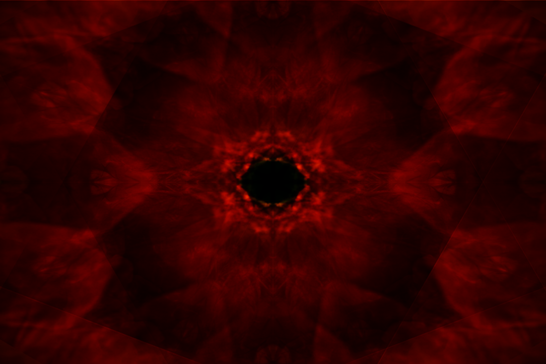
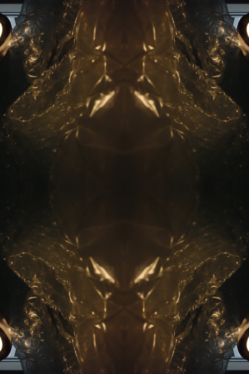
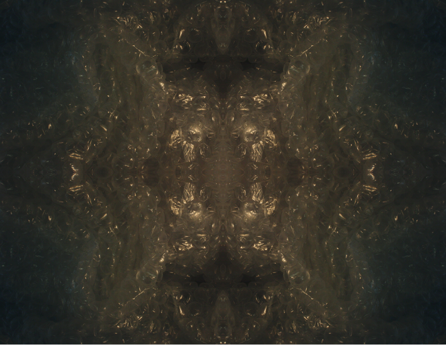
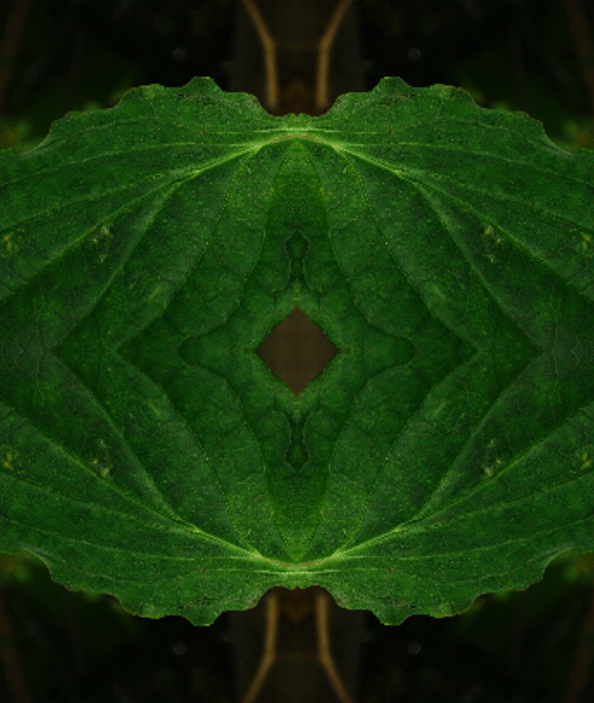
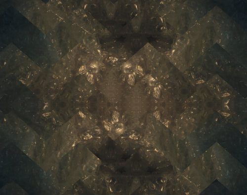
Kaleidoscope style images:


For these images, I zoomed in on everyday objects and cropped the images before copying them and flipping them to create these abstract style images, highlighting the textures of different objects. The below images were the result and the above are the original images after being cropped.


Manipulation in the style of Imogen Cunningham and Edward Weston:


Manipulations in the style of Andy Small:


Manipulations in the style of Lucy Shires:


My own manipulations:

https://design.tutsplus.com/tutorials/how-to-create-a-glitch-effect--cms-27681
|

|
https://www.youtube.com/watch?v=ffW_9bXGqDs
|
https://www.youtube.com/watch?v=GkCqBNlGxg8
|
Screenshots:


Combination Edits:
Combination screenshots:


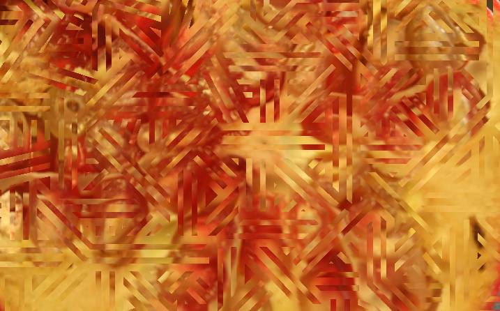
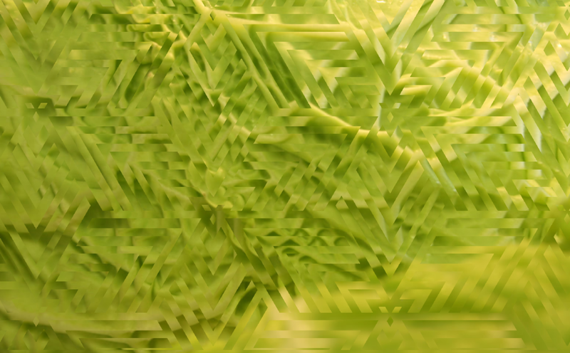
For my pattern photos I used plain black and white patterns with clipping masks and the move tool to create these images. I aimed to create juxtaposition in the images as most of them had smooth natural lines that were contrasted by the geometric patterns


Final Gallery:
Evaluation:
The theme for this project was texture and I believe all of the images I selected for a final piece convey the texture of the subject well. I enjoyed this project overall as it helped me learn to use my camera and it helped me to be able to learn which settings I have to change to gain my chosen effect for photos (most specifically how to change the aperture to keep things in focus in this context). During the project I most enjoyed taking photos of manmade textures and doing kaleidoscope style editing to achieve a strange "mystical" effect. I used snipping tool to document screenshots of my process of editing these photos. Throughout this project I got more used to using the camera and adjusting the settings such as the aperture or the white balance, I enjoyed getting used to using the camera and the settings. For my next project I would like to experiment more with different lighting styles to see the effect on the subject and the overall photographs and to be more experimental with Photopea to see what kind of final images I can create. From focusing on photographers such as Lucy Shires and Annabelle Breakey I learned how to capture texture well in images and to use more consistent tones like Shires for the image to look consistent and together or to use contrasting colours to emphasize the subject in a photograph. I believe my edits (specifically my kaleidoscope edits) were the most successful. The main problem in this project was that I was still learning how to use the camera and the different terminology and settings however I overcame that by practicing using the different settings and learning what effects they would have on my photographs. If given the opportunity to complete this project again I would try to find more different textures to photograph in my own shoots and attempt to use the macro lens more. Overall I enjoyed this topic as it allowed me to focus more on everyday items and to almost see them in a different light and to make them look different in photographs (e.g. the lighting on the "desert" photo made textured paper look like a desert landscape).
